Formular Organizar Unir Reflexionar
Contexto
« Formulate, Organize, Unite and Reflect. »
« With the limited time, that we have on this Earth, I plan on leaving, a few things behind. »
No soy profesor, estas son mis propias notas, las de un estudiante insignificante, Aaron (Iso) Pescasio.
Como quiero hacer que la app de notas sea accesible al público, creé una cuenta gratuita de GitHub y una cuenta gratuita de Cloudflare.
F.O.U.R Fumadocs App
Para empezar a crear, primero instalo el editor VSCode, NodeJS, npm y git.
winget install -e --id Microsoft.VisualStudioCode
winget install -e --id OpenJS.NodeJS
winget install -e --id git.git

$pc = "C:\PC-Local"
if (-not (Test-Path -Path $pc)) {
    New-Item -ItemType Directory -Path $pc -Force
}

code $pc
Luego instalo Fumadocs, que es el mejor "wiki" de código abierto que uso como plantilla.
npm create fumadocs-app

### 0. Introduce el nombre del proyecto => safe ###

### 1. Escribe y (para continuar) ###

### 2. Elige una plantilla => Next.js ###

### 3. Usar el directorio `/src` => No ###

### 4. ¿Configurar linter? => ESLint ###

### 5. ¿Elegir una solución de búsqueda? => Predeterminada ###

### 6. ¿Quieres instalar los paquetes automáticamente? =>> Sí ###

### Abrir VSCode en la carpeta safe ###

code safe
Llamaré a este proyecto safe, porque deseo vivir en un futuro seguro.
Ejecuto la aplicación localmente en mi PC usando el comando npm run dev.
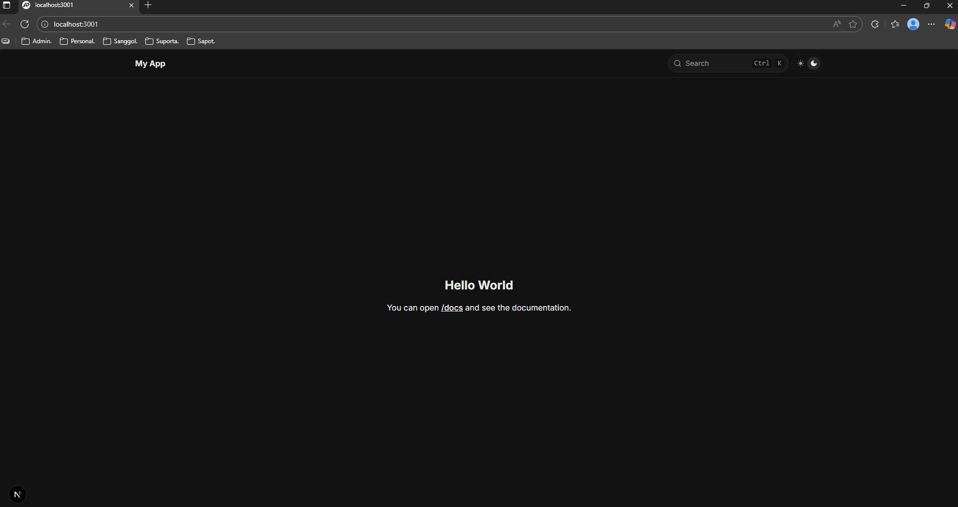
Así es como se ve Fumadocs por defecto.
Step 1: First git commit from npm create fumadocs
En esencia, git es local. Hice mi primer commit ejecutando npm create fumadocs; por defecto “dice” que he inicializado el proyecto. Y puedo hacer clic en ese commit para ver los archivos que se añadieron o modificaron en ese commit específico.
Piensa en los commits como una captura o un punto de guardado en un juego; este commit sería mi nivel 0, y siempre puedo volver a ese punto de guardado usando un comando como git revert.
Y si has jugado antes, sabes que es mejor tener un punto de guardado antes de hacer un cambio grande, como luchar contra un jefe, o incluso un cambio pequeño, como probar todos los diálogos en un videojuego para conseguir el final bueno.
Step 2: Enabled git last modified time + Updated README
Antes de empezar a crear documentos, habilité “Last modified time” para saber cuándo actualicé por última vez un documento en el propio sitio web.
import {
  defineConfig,
  defineDocs,
  frontmatterSchema,
  metaSchema,
} from 'fumadocs-mdx/config';

// Aquí puedes personalizar los esquemas de Zod para el frontmatter y `meta.json`
// ver https://fumadocs.dev/docs/mdx/collections
export const docs = defineDocs({
  dir: 'content/docs',
  docs: {
    schema: frontmatterSchema,
    postprocess: {
      includeProcessedMarkdown: true,
    },
  },
  meta: {
    schema: metaSchema,
  },
});

export default defineConfig({
  lastModifiedTime: 'git',
  mdxOptions: {
    // MDX options
  },
});# Formulate Organize Unite Reflect.
> [!IMPORTANT]
> With the limited time, that we have on this Earth, I plan on leaving, a few things behind.Step 3: Added components folder for icons + buttons docs
También añadí mi carpeta de componentes con iconos como YouTube, etc. Además contiene la lógica de los botones que veremos más adelante en la página raíz.
### Crear carpeta de componentes ###

$compo = ".\components"

New-Item $compo -ItemType Directory -Force

### Crear hero.tsx ###

$hero_content  = @'
import { JSX } from 'react';

interface HeroProps {
  title: string;
  desc: string;
  icon: JSX.Element;
}

export default function Hero({ title, desc, icon }: HeroProps) {
  return (
    <div className="flex flex-col items-center gap-3 text-center">
      <div className="bg-fd-card aspect-square rounded-full border p-6">{icon}</div>
      <h1 className="text-2xl font-semibold">{title}</h1>
      <p className="text-fd-muted-foreground">{desc}</p>
    </div>
  );
}
'@

Set-Content -Path (Join-Path $compo "hero.tsx") -Value $hero_content -Encoding UTF8

### Crear to-docs-btn.tsx ###

$docsbtn_content = @'
import { cn } from 'fumadocs-ui/utils/cn';
import Link from 'next/link';
import { JSX } from 'react';

interface ToDocsBtnProps {
  href?: string;
  title: string;
  icon: JSX.Element;
}

export default function ToDocsBtn({ href, title, icon }: ToDocsBtnProps) {
  return (
    <Link
      href={href || ''}
      aria-disabled={!href}
      className={cn(
        'flex items-center gap-3 overflow-hidden rounded-md border px-3 py-3 lg:gap-4 lg:px-4 lg:py-3',
        href ? 'bg-fd-card hover:bg-fd-muted' : 'text-fd-muted-foreground pointer-events-none',
      )}
    >
      <span className={cn('rounded-sm border p-1', href ? 'bg-fd-muted border-fd-accent' : '')}>{icon}</span>
      <span>{title}</span>
    </Link>
  );
}
'@

Set-Content -Path (Join-Path $compo "to-docs-btn.tsx") -Value $docsbtn_content -Encoding UTF8

### Crear carpeta component\icons ###

$compo_icons = ".\components\icons"
New-Item $compo_icons -ItemType Directory -Force

### Crear four.tsx ###

$four_icon = @'
import { SVGProps } from 'react';

export default function IconFour(props: SVGProps<SVGSVGElement>) {
  return (
    <svg
      xmlns="http://www.w3.org/2000/svg"
      width="1em"
      height="1em"
      viewBox="0 0 48 48"
      {...props}
    >
      <g
        fill="none"
        stroke="currentColor"
        strokeLinecap="round"
        strokeLinejoin="round"
        strokeWidth="4"
      >
        <path d="M26.977 34V14L18 26.997v2.023h12" />
      </g>
    </svg>
  );
}
'@

Set-Content -Path (Join-Path $compo_icons "four.tsx") -Value $four_icon -Encoding UTF8

### Crear home.tsx ###

$home_icon = @'
import { SVGProps } from 'react';

export default function IconHome(props: SVGProps<SVGSVGElement>) {
  return (
    <svg xmlns="http://www.w3.org/2000/svg" width="32" height="32" viewBox="0 0 24 24" {...props}>
      {/* Icon from Material Symbols by Google - https://github.com/google/material-design-icons/blob/master/LICENSE */}
      <path
        fill="currentColor"
        d="M6 19h3v-6h6v6h3v-9l-6-4.5L6 10zm-2 2V9l8-6l8 6v12h-7v-6h-2v6zm8-8.75"
      ></path>
    </svg>
  );
}
'@

Set-Content -Path (Join-Path $compo_icons "home.tsx") -Value $home_icon -Encoding UTF8

### Crear azure.tsx ###

$azure_icon = @'
import { SVGProps } from 'react';

export default function IconAzure(props: SVGProps<SVGSVGElement>) {
  return (
    <svg xmlns="http://www.w3.org/2000/svg" width="32" height="32" viewBox="0 0 16 16" {...props}>
      {/* Icon from Codicons by Microsoft Corporation - https://github.com/microsoft/vscode-codicons/blob/main/LICENSE */}
      <path
        fill="currentColor"
        fillRule="evenodd"
        d="m15.37 13.68l-4-12a1 1 0 0 0-1-.68H5.63a1 1 0 0 0-.95.68l-4.05 12a1 1 0 0 0 1 1.32h2.93a1 1 0 0 0 .94-.68l.61-1.78l3 2.27a1 1 0 0 0 .6.19h4.68a1 1 0 0 0 .98-1.32m-5.62.66a.32.32 0 0 1-.2-.07L3.9 10.08l-.09-.07h3l.08-.21l1-2.53l2.24 6.63a.34.34 0 0 1-.38.44m4.67 0H10.7a1 1 0 0 0 0-.66l-4.05-12h3.72a.34.34 0 0 1 .32.23l4.05 12a.34.34 0 0 1-.32.43"
        clipRule="evenodd"
      />
    </svg>
  );
}
'@

Set-Content -Path (Join-Path $compo_icons "azure.tsx") -Value $azure_icon -Encoding UTF8

### Crear intune.tsx ###

$intune_icon = @'
import { SVGProps } from 'react';

export default function IconIntune(props: SVGProps<SVGSVGElement>) {
  return (
    <svg xmlns="http://www.w3.org/2000/svg" width="32" height="32" viewBox="0 0 24 24" {...props}>
      {/* Icon from BoxIcons by Atisa - https://creativecommons.org/licenses/by/4.0/ */}
      <path d="M3 5.557l7.357-1.002l.004 7.097l-7.354.042L3 5.557zm7.354 6.913l.006 7.103l-7.354-1.011v-6.14l7.348.048zm.892-8.046L21.001 3v8.562l-9.755.077V4.424zm9.758 8.113l-.003 8.523l-9.755-1.378l-.014-7.161l9.772.016z" fill="currentColor"/>
    </svg>
  );
}
'@

Set-Content -Path (Join-Path $compo_icons "intune.tsx") -Value $intune_icon -Encoding UTF8

### Crear python.tsx ###

$python_icon = @'
import { SVGProps } from 'react';

export default function IconPython(props: SVGProps<SVGSVGElement>) {
  return (
    <svg xmlns="http://www.w3.org/2000/svg" width="1em" height="1em" viewBox="0 0 24 24" {...props}>
      {/* Icon from Material Design Icons by Pictogrammers - https://github.com/Templarian/MaterialDesign/blob/master/LICENSE */}
      <path fill="currentColor" d="M19.14 7.5A2.86 2.86 0 0 1 22 10.36v3.78A2.86 2.86 0 0 1 19.14 17H12c0 .39.32.96.71.96H17v1.68a2.86 2.86 0 0 1-2.86 2.86H9.86A2.86 2.86 0 0 1 7 19.64v-3.75a2.85 2.85 0 0 1 2.86-2.85h5.25a2.85 2.85 0 0 0 2.85-2.86V7.5zm-4.28 11.79c-.4 0-.72.3-.72.89s.32.71.72.71a.71.71 0 0 0 .71-.71c0-.59-.32-.89-.71-.89m-10-1.79A2.86 2.86 0 0 1 2 14.64v-3.78A2.86 2.86 0 0 1 4.86 8H12c0-.39-.32-.96-.71-.96H7V5.36A2.86 2.86 0 0 1 9.86 2.5h4.28A2.86 2.86 0 0 1 17 5.36v3.75a2.85 2.85 0 0 1-2.86 2.85H8.89a2.85 2.85 0 0 0-2.85 2.86v2.68zM9.14 5.71c.4 0 .72-.3.72-.89s-.32-.71-.72-.71c-.39 0-.71.12-.71.71s.32.89.71.89"/>
    </svg>
  );
}
'@

Set-Content -Path (Join-Path $compo_icons "python.tsx") -Value $python_icon -Encoding UTF8

### Crear github.tsx ###

$github_icon = @'
import { SVGProps } from 'react';

export default function IconGitHub(props: SVGProps<SVGSVGElement>) {
  return (
    <svg xmlns="http://www.w3.org/2000/svg" width="32" height="32" viewBox="0 0 24 24" {...props}>
      {/* Icon from Material Design Icons by Pictogrammers - https://github.com/Templarian/MaterialDesign/blob/master/LICENSE */}
      <path
        d="M5 3h14a2 2 0 0 1 2 2v14a2 2 0 0 1-2 2h-4.44c-.32-.07-.33-.68-.33-.89l.01-2.47c0-.84-.29-1.39-.61-1.67c2.01-.22 4.11-.97 4.11-4.44c0-.98-.35-1.79-.92-2.42c.09-.22.4-1.14-.09-2.38c0 0-.76-.23-2.48.93c-.72-.2-1.48-.3-2.25-.31c-.76.01-1.54.11-2.25.31c-1.72-1.16-2.48-.93-2.48-.93c-.49 1.24-.18 2.16-.09 2.38c-.57.63-.92 1.44-.92 2.42c0 3.47 2.1 4.22 4.1 4.47c-.26.2-.49.6-.57 1.18c-.52.23-1.82.63-2.62-.75c0 0-.48-.86-1.38-.93c0 0-.88 0-.06.55c0 0 .59.28 1 1.32c0 0 .52 1.75 3.03 1.21l.01 1.53c0 .21-.02.82-.34.89H5a2 2 0 0 1-2-2V5a2 2 0 0 1 2-2z"
        fill="currentColor"
      />
    </svg>
  );
}
'@

Set-Content -Path (Join-Path $compo_icons "github.tsx") -Value $github_icon -Encoding UTF8

### Crear instagram.tsx ###

$instagram_icon = @'
import { SVGProps } from 'react';

export default function IconInstagram(props: SVGProps<SVGSVGElement>) {
  return (
    <svg xmlns="http://www.w3.org/2000/svg" width="32" height="32" viewBox="0 0 16 16" {...props}>
      {/* Icon from FormKit Icons by FormKit, Inc - https://github.com/formkit/formkit/blob/master/packages/icons/LICENSE */}
      <path fill="currentColor" d="M8 5.67C6.71 5.67 5.67 6.72 5.67 8S6.72 10.33 8 10.33S10.33 9.28 10.33 8S9.28 5.67 8 5.67M15 8c0-.97 0-1.92-.05-2.89c-.05-1.12-.31-2.12-1.13-2.93c-.82-.82-1.81-1.08-2.93-1.13C9.92 1 8.97 1 8 1s-1.92 0-2.89.05c-1.12.05-2.12.31-2.93 1.13C1.36 3 1.1 3.99 1.05 5.11C1 6.08 1 7.03 1 8s0 1.92.05 2.89c.05 1.12.31 2.12 1.13 2.93c.82.82 1.81 1.08 2.93 1.13C6.08 15 7.03 15 8 15s1.92 0 2.89-.05c1.12-.05 2.12-.31 2.93-1.13c.82-.82 1.08-1.81 1.13-2.93c.06-.96.05-1.92.05-2.89m-7 3.59c-1.99 0-3.59-1.6-3.59-3.59S6.01 4.41 8 4.41s3.59 1.6 3.59 3.59s-1.6 3.59-3.59 3.59m3.74-6.49c-.46 0-.84-.37-.84-.84s.37-.84.84-.84s.84.37.84.84a.8.8 0 0 1-.24.59a.8.8 0 0 1-.59.24Z"/>
    </svg>
  );
}
'@

Set-Content -Path (Join-Path $compo_icons "instagram.tsx") -Value $instagram_icon -Encoding UTF8

### Crear linkedin.tsx ###

$linkedin_icon = @'
import { SVGProps } from 'react';

export default function IconLinkedin(props: SVGProps<SVGSVGElement>) {
  return (
    <svg xmlns="http://www.w3.org/2000/svg" width="32" height="32" viewBox="0 0 24 24" {...props}>
      {/* Icon from Material Design Icons by Pictogrammers - https://github.com/Templarian/MaterialDesign/blob/master/LICENSE */}
      <path
        fill="currentColor"
        d="M19 3a2 2 0 0 1 2 2v14a2 2 0 0 1-2 2H5a2 2 0 0 1-2-2V5a2 2 0 0 1 2-2zm-.5 15.5v-5.3a3.26 3.26 0 0 0-3.26-3.26c-.85 0-1.84.52-2.32 1.3v-1.11h-2.79v8.37h2.79v-4.93c0-.77.62-1.4 1.39-1.4a1.4 1.4 0 0 1 1.4 1.4v4.93zM6.88 8.56a1.68 1.68 0 0 0 1.68-1.68c0-.93-.75-1.69-1.68-1.69a1.69 1.69 0 0 0-1.69 1.69c0 .93.76 1.68 1.69 1.68m1.39 9.94v-8.37H5.5v8.37z"
      ></path>
    </svg>
  );
}
'@

Set-Content -Path (Join-Path $compo_icons "linkedin.tsx") -Value $linkedin_icon -Encoding UTF8

### Crear youtubev2.tsx ###

$youtubev2_icon = @'
import { SVGProps } from 'react';

export default function IconYouTubeV2(props: SVGProps<SVGSVGElement>) {
  return (
    <svg xmlns="http://www.w3.org/2000/svg" width="28" height="32" viewBox="0 0 448 512" {...props}>
      {/* Icon from Font Awesome Brands by Dave Gandy - https://creativecommons.org/licenses/by/4.0/ */}
      <path fill="currentColor" d="m282 256.2l-95.2-54.1v108.2zM384 32H64C28.7 32 0 60.7 0 96v320c0 35.3 28.7 64 64 64h320c35.3 0 64-28.7 64-64V96c0-35.3-28.7-64-64-64m14.4 136.1c7.6 28.6 7.6 88.2 7.6 88.2s0 59.6-7.6 88.1c-4.2 15.8-16.5 27.7-32.2 31.9C337.9 384 224 384 224 384s-113.9 0-142.2-7.6c-15.7-4.2-28-16.1-32.2-31.9c-7.6-28.6-7.6-88.2-7.6-88.2s0-59.7 7.6-88.2c4.2-15.8 16.5-28.2 32.2-32.4C110.1 128 224 128 224 128s113.9 0 142.2 7.7c15.7 4.2 28 16.6 32.2 32.4"/>
    </svg>
  );
}
'@

Set-Content -Path (Join-Path $compo_icons "youtubev2.tsx") -Value $youtubev2_icon -Encoding UTF8
Step 4: Updated global css file to have the color yellow
Personalmente prefiero el color amarillo, así que modifiqué el archivo global.css.
@import 'tailwindcss';
@import 'fumadocs-ui/css/neutral.css';
@import 'fumadocs-ui/css/preset.css';

@theme {
    --color-fd-background: hsl(0, 0%, 96%);
    --color-fd-foreground: hsl(0, 0%, 3.9%);
    --color-fd-muted: hsl(0, 0%, 96.1%);
    --color-fd-muted-foreground: hsl(0, 0%, 45.1%);
    --color-fd-popover: hsl(0, 0%, 98%);
    --color-fd-popover-foreground: hsl(0, 0%, 15.1%);
    --color-fd-card: hsl(0, 0%, 94.7%);
    --color-fd-card-foreground: hsl(0, 0%, 3.9%);
    --color-fd-border: hsla(0, 0%, 80%, 50%);
    --color-fd-primary: hsl(0, 0%, 9%);
    --color-fd-primary-foreground: hsl(0, 0%, 98%);
    --color-fd-secondary: hsl(0, 0%, 93.1%);
    --color-fd-secondary-foreground: hsl(0, 0%, 9%);
    --color-fd-accent: hsla(0, 0%, 82%, 50%);
    --color-fd-accent-foreground: hsl(0, 0%, 9%);
    --color-fd-ring: hsl(0, 0%, 63.9%);
}

.dark {
    --color-fd-background: hsl(0, 0%, 7.04%);
    --color-fd-foreground: hsl(0, 0%, 92%);
    --color-fd-muted: hsl(0, 0%, 12.9%);
    --color-fd-muted-foreground: hsla(0, 0%, 70%, 0.8);
    --color-fd-popover: hsl(0, 0%, 11.6%);
    --color-fd-popover-foreground: hsl(0, 0%, 86.9%);
    --color-fd-card: hsl(0, 0%, 9.8%);
    --color-fd-card-foreground: hsl(0, 0%, 98%);
    --color-fd-border: hsla(0, 0%, 40%, 20%);
    --color-fd-primary: hsl(54, 100%, 76%);
    --color-fd-primary-foreground: hsl(0, 0%, 9%);
    --color-fd-secondary: hsl(0, 0%, 12.9%);
    --color-fd-secondary-foreground: hsl(0, 0%, 92%);
    --color-fd-accent: hsla(0, 0%, 40.9%, 30%);
    --color-fd-accent-foreground: hsl(0, 0%, 90%);
    --color-fd-ring: hsl(0, 0%, 54.9%);
}
Step 5: Added consts.ts for docs title + description
A continuación añadí el archivo consts que contiene el título y la descripción de una carpeta específica como "Azure".
import IconHome from './components/icons/home';
import IconAzure from './components/icons/azure';
import IconIntune from './components/icons/intune';
import IconPython from './components/icons/python';

export const DOCS = {
    home: {
        title: "Home",
        path: "/docs/home",
        icon: IconHome,
        desc: "Formular, Organizar, Unir, Reflexionar.",
    },
    azure: {
        title: "Azure",
        path: "/docs/azure",
        icon: IconAzure,
        desc: "La plataforma en la cloud de Microsoft que ofrece una gama completa de servicios (200+) para diseñar, implementar y gestionar aplicaciones, infraestructuras y soluciones, con flexibilidad, escalabilidad y seguridad adaptadas a las necesidades modernas.",
    },
    intune: {
        title: "Intune",
        path: "/docs/intune",
        icon: IconIntune,
        desc: "Una solución completa en la cloud de Microsoft que permite gestionar y asegurar los dispositivos y aplicaciones de tu organización.",
    },
    python: {
        title: "Python",
        path: "/docs/python",
        icon: IconPython,
        desc: "Un lenguaje de programación interpretado de alto nivel conocido por su simplicidad y versatilidad, ampliamente utilizado para el desarrollo web, análisis de datos, inteligencia artificial y automatización.",
    },
};
Step 6: Updated Root page + Layout icons
Luego actualicé la página raíz y el diseño de la barra lateral, llamando a todos los iconos de mi carpeta de componentes y convirtiéndolos en botones clicables.
import ToDocsBtn from '@/components/to-docs-btn';
import { DOCS } from '@/consts';
import IconFour from '@/components/icons/four';

export default function HomePage() {
  const title = "Formular, Organizar, Unir, Reflexionar.";

  const paragraph = (
    <>
      With the limited time, that we have on this Earth, I plan on leaving, a few things behind.<br />
      - AIM. FOUR. SAFE. FUTURE.
    </>
  );

  const description = (
    <>
      <a href={`/docs/home`}>cd /docs</a>
      <br /><br />
      <span className="text-sm">{paragraph}</span>
    </>
  );

  return (
    <>
      <main className="container flex flex-col gap-8 py-8 lg:gap-10 lg:py-10 max-w-7xl">
        {/* Hero */}
        <div className="flex flex-col items-center text-center">
          <div className="bg-fd-card mb-4 aspect-square rounded-full border p-6 lg:p-6">
            <IconFour className="size-36 shrink-0 lg:size-32 icon-adjust-memo -ml-1" aria-label="safe.apescasio.fr" />
          </div>
          <h1 className="text-2xl font-semibold lg:text-4xl">{title}</h1>
          <p className="text-fd-muted-foreground lg:text-lg">{description}</p>
        </div>

        {/* Docs */}
        <div className="flex flex-col items-center gap-8">
          <div className="grid max-w-4xl grid-cols-2 lg:grid-cols-4 gap-4 w-full justify-center">
            {Object.values(DOCS).map(({ title, path, icon: Icon }) => (
              <ToDocsBtn
                key={title}
                title={title}
                href={path}
                icon={<Icon className="size-6 shrink-0 lg:size-4" />}
              />
            ))}
          </div>

          <p
            suppressHydrationWarning
            className="text-fd-muted-foreground -mt-4 text-center text-sm lg:text-base"
          >
            © {new Date().getFullYear()} Aaron (Iso) Pescasio /{" "}
            <a
              href="https://apescasio.fr/"
              target="_blank"
              className="hover:text-fd-accent-foreground underline"
            >
              apescasio.fr
            </a>
          </p>
        </div>

      </main>
    </>
  );
}import type { BaseLayoutProps } from 'fumadocs-ui/layouts/shared';
import IconLinkedin from "@/components/icons/linkedin";
import IconYouTubeV2 from "@/components/icons/youtubev2";
import IconInstagram from "@/components/icons/instagram";
import IconGitHub from "@/components/icons/github";
import IconFour from "@/components/icons/four";
export function baseOptions(): BaseLayoutProps {
return {
nav: {
title: (
<>
<IconFour
className="size-9 shrink-0"
aria-label="Four Icon"
width={44}
height={44}
/>
Safe
</>
),
url: `/`,
},
links: [
{
type: "main",
text: "Aaron (Iso) Pescasio",
url: "https://apescasio.fr",
},
{
type: "icon",
text: "YouTube",
url: "https://youtube.com/@apescasio",
icon: (
<span style={{ transform: "scale(1.2)" }}>
<IconYouTubeV2 />
</span>
),
external: true,
},
{
type: "icon",
text: "LinkedIn",
url: "https://www.linkedin.com/in/aaron-pescasio",
icon: (
<span style={{ marginLeft: "-7px", transform: "scale(1.3)" }}>
<IconLinkedin />
</span>
),
external: true,
},
{
type: "icon",
text: "Instagram",
url: "https://www.instagram.com/himapescasio",
icon: (
<span style={{ marginLeft: "-7px", transform: "scale(1.2)" }}>
<IconInstagram />
</span>
),
external: true,
},
{
type: "icon",
text: "GitHub",
url: "https://github.com/apescasio",
icon: (
<span style={{ marginLeft: "-7px", transform: "scale(1.3)" }}>
<IconGitHub />
</span>
),
external: true,
},
],
};
}Step 7: Added IsIndexPage logic
Después añadí una lógica que detecta si un documento es la página índice de una carpeta correspondiente, como "Intune", por ejemplo.
Si es una página índice:
- El icono de la carpeta correspondiente aparecerá en la parte superior central de la página índice.
- Se elimina la tabla de contenidos, ya que por defecto se añade automáticamente a cada documento y no soy fan de ello.
import { DOCS } from '@/consts';

export function getDocsInfo(key: string) {
    const doc = DOCS[key as keyof typeof DOCS];
    if (doc) {
        return doc;
    }
}

export function isIndexPage(path: string) {
    const parts = path.split('/');
    return parts.at(-1) === 'index.mdx';
}

export function getDirname(slugs: string[], isIndex: boolean) {
    if (isIndex) return slugs.at(-1);
    return slugs.at(-2);
}import { getPageImage, source } from '@/lib/source';
import {
DocsBody,
DocsDescription,
DocsPage,
DocsTitle,
} from 'fumadocs-ui/page';
import { notFound } from 'next/navigation';
import { getMDXComponents } from '@/mdx-components';
import type { Metadata } from 'next';
import { createRelativeLink } from 'fumadocs-ui/mdx';
import { getDirname, getDocsInfo, isIndexPage } from "@/lib/utils";
import { createElement } from "react";
import Hero from "@/components/hero";
import { DOCS } from "@/consts";
export default async function Page(props: PageProps<'/docs/[[...slug]]'>) {
const params = await props.params;
const page = source.getPage(params.slug);
if (!page) notFound();
const MDX = page.data.body;
const isIndex = isIndexPage(page.path);
const dirName = getDirname(page.slugs, isIndex);
return (
<DocsPage
toc={isIndex ? undefined : page.data.toc}
tableOfContent={isIndex ? undefined : { style: "clerk" }}
full={page.data.full}
lastUpdate={
page.data.lastModified ? new Date(page.data.lastModified) : undefined
}
>
{isIndex && dirName ? (
<IndexHead folder={dirName} />
) : (
<>
<DocsTitle>{page.data.title}</DocsTitle>
<DocsDescription>{page.data.description}</DocsDescription>
</>
)}
<DocsBody>
<MDX
components={getMDXComponents({
a: createRelativeLink(source, page),
})}
/>
</DocsBody>
</DocsPage>
);
}
function IndexHead({ folder }: { folder: string }) {
const docsInfo = getDocsInfo(folder);
if (!docsInfo) return null;
const { icon, title } = docsInfo;
const desc = DOCS[folder as keyof typeof DOCS]?.desc ?? "";
return (
<>
<Hero
title={title}
desc={desc}
icon={createElement(icon, { className: "size-12 shrink-0" })}
/>
<hr />
</>
);
}
export async function generateStaticParams() {
return source.generateParams();
}
export async function generateMetadata(
props: PageProps<'/docs/[[...slug]]'>,
): Promise<Metadata> {
const params = await props.params;
const page = source.getPage(params.slug);
if (!page) notFound();
return {
title: page.data.title,
description: page.data.description,
openGraph: {
images: getPageImage(page).url,
},
};
}También añadí la lógica para que los iconos aparezcan en el "Folder Switcher".
import { docs } from '@/.source';
import { type InferPageType, loader } from 'fumadocs-core/source';
import { lucideIconsPlugin } from 'fumadocs-core/source/lucide-icons';
import { DOCS } from "@/consts";
import { createElement } from "react";
import { getDocsInfo } from "./utils"; // Added import for getDocsInfo

// See https://fumadocs.dev/docs/headless/source-api for more info
export const source = loader({
  baseUrl: '/docs',
  source: docs.toFumadocsSource(),
  plugins: [lucideIconsPlugin()],
  icon(icon) {
    if (!icon) {
      return;
    }

    // Use getDocsInfo to fetch icon details
    const doc = getDocsInfo(icon);
    if (doc) {
      return createElement(doc.icon);
    }

    // Fallback to DOCS constant if getDocsInfo doesn't return a result
    const fallbackDoc = DOCS[icon as keyof typeof DOCS];
    if (fallbackDoc) {
      return createElement(fallbackDoc.icon);
    }
  },
});

export function getPageImage(page: InferPageType<typeof source>) {
  const segments = [...page.slugs, 'image.png'];

  return {
    segments,
    url: `/og/docs/${segments.join('/')}`,
  };
}

export async function getLLMText(page: InferPageType<typeof source>) {
  const processed = await page.data.getText('processed');

  return `# ${page.data.title}

${processed}`;
}
Step 8: Added folders in content\docs
Ahora, para empezar a documentar, creo una carpeta específica para cada "tema".
Como trabajo en TI, la mayoría de documentos que creo tratan sobre ello, pero realmente puedes hacer lo que quieras, desde Poesía hasta Matemáticas o incluso Cocina.
### Define las carpetas que quieres crear dinámicamente ###

$folders = @(
    @{ Name = "Home";    Icon = "home";    Root = $true }
    @{ Name = "Azure";   Icon = "azure";   Root = $true }
    @{ Name = "Intune";  Icon = "intune";  Root = $true }
    @{ Name = "Python";  Icon = "python";  Root = $true }
)

### Ruta base de docs ###

$docs_path = ".\content\docs"

### Recorre cada carpeta para crear el archivo index ###

foreach ($f in $folders) {

    $title = $f.Name

    $folder_name = $f.Name.ToLower()

    $folder_path = Join-Path $docs_path $folder_name
    $icon       = $f.Icon
    $is_root     = $f.Root

    New-Item -Path $folder_path -ItemType Directory

    $index_file = @"
---
title: $title Docs
---
## Introduction

Welcome to the $title docs! You can start writing documents in `/content/docs/$folder_name`.

## What is Next?
<Cards>
  <Card title="Learn more about Next.js" href="https://nextjs.org/docs" />
  <Card title="Learn more about Fumadocs" href="https://fumadocs.dev" />
</Cards>
"@
    Set-Content -Path (Join-Path $folder_path "index.mdx") -Value $index_file -Encoding UTF8

    ### Crear meta.json dinámicamente ###
    $meta_object = [PSCustomObject]@{
        title = $title
        root  = $is_root
        pages = @("index")
        icon  = $icon
    }
    $meta_json = $meta_object | ConvertTo-Json -Depth 5
    Set-Content -Path (Join-Path $folder_path "meta.json") -Value $meta_json -Encoding UTF8
}

  ### Crear meta.json global en content\docs ###

$global_pages = @()
foreach ($f in $folders) {
    $global_pages += $f.Name.ToLower()
}

$global_meta = [PSCustomObject]@{
    pages = $global_pages
}

$global_meta_json = $global_meta | ConvertTo-Json -Depth 5

Set-Content -Path (Join-Path $docs_path "meta.json") -Value $global_meta_json -Encoding UTF8
Step 9: Added deployment workflow
Para hacer la app accesible al público, primero habilité la exportación "estática".
import { createMDX } from 'fumadocs-mdx/next';

const withMDX = createMDX();

/** @type {import('next').NextConfig} */
const config = {
  reactStrictMode: true,
  output: 'export',
  images: {
    unoptimized: true,
  },
};

export default withMDX(config);import { source } from '@/lib/source';
import { createFromSource } from 'fumadocs-core/search/server';
export const revalidate = false;
export const { staticGET: GET } = createFromSource(source, {
// https://docs.orama.com/docs/orama-js/supported-languages
language: 'english',
});import { RootProvider } from 'fumadocs-ui/provider/next';
import './global.css';
import { Inter } from 'next/font/google';
const inter = Inter({
subsets: ['latin'],
});
export default function Layout({ children }: LayoutProps<'/'>) {
return (
<html lang="en" className={inter.className} suppressHydrationWarning>
<body className="flex min-h-screen flex-col">
<RootProvider search={{ options: { type: 'static' } }}>{children}</RootProvider>
</body>
</html>
);
}Y creé un archivo deploy.yml que se usará para desplegar en Cloudflare Pages, que es completamente gratuito.
### Crear carpeta .github\workflows ###

$github_workflow = ".github\workflows"

New-Item -Path $github_workflow -ItemType Directory -Force

### Crear deploy.yml ###

$deploy_content  = @'
name: Deploy

on:
  workflow_dispatch:

jobs:
  publish:
    runs-on: ubuntu-latest
    permissions:
      contents: read
      deployments: write
    name: Deploy to Cloudflare Pages
    steps:
      - name: Checkout
        uses: actions/checkout@v4

      - name: Install dependencies
        run: npm ci

      - name: Build
        run: npm run build
        env:
          NEXT_TELEMETRY_DISABLED: 1

      - name: Deploy
        uses: cloudflare/wrangler-action@v3
        with:
          apiToken: ${{ secrets.CLOUDFLARE_API_TOKEN }}
          accountId: ${{ secrets.CLOUDFLARE_ACCOUNT_ID }}
          command: pages deploy out --project-name=${{ vars.CLOUDFLARE_PROJECT_NAME }}
'@

Set-Content -Path (Join-Path $github_workflow "deploy.yml") -Value $deploy_content -Encoding UTF8
Step 10: Create GitHub Repo & Cloudflare Pages
Como ahora ya tengo algunos documentos y he hecho mis modificaciones, por fin puedo crear un repositorio en GitHub => hacer git push (usando HTTPS) al repositorio => y configurar el repo para el despliegue en Cloudflare.
Pasos a realizar después de crear el repo:
- GitHub Repo Settings
- GitHub Security => Secrets and Variables => Actions
- GitHub New Repository Variable
- GitHub Variable Name => CLOUDFLARE_PROJECT_NAME
- Goto Cloudflare Workers & Pages
- Cloudflare Create Application => Get Started Pages
- Cloudflare Drag and drop Get Started
- Cloudflare Project name => safe
- GitHub Variable Value => safe
- GitHub Secrets Tab
- GitHub New Repository Secret
- GitHub Secrets Name => CLOUDFLARE_ACCOUNT_ID
- Goto Cloudflare Dashboard and click "..." to copy Account ID
- GitHub Secrets Value => Your_CloudflareAccount_ID_1234
- GitHub Secrets Name => CLOUDFLARE_API_TOKEN
- Goto Cloudflare Profile API Tokens
- Cloudflare Create Token => Create Custom Token
- Cloudflare Create Custom Token Get Started
- Cloudflare Token Name => safe
- Cloudflare Permissions => Account => Select item... (Cloudflare Pages) => Edit
- Cloudflare Continue to summary
- Cloudflare Create token => Copy token
- GitHub Secrets Value => Your_CloudflareAPI_TOKEN_1234
- GitHub Actions Tab
- GitHub Deploy => Run workflow 2x
- Cloudflare Workers & Pages => safe => Domain link
Ahora puedo ver el enlace a la rama main en Cloudflare Pages; este enlace específico lo genera Cloudflare aleatoriamente y nunca cambiará.
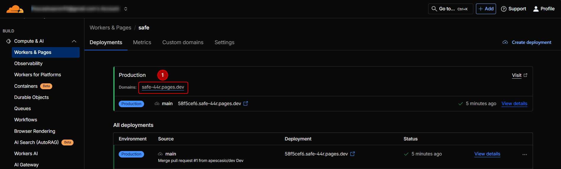
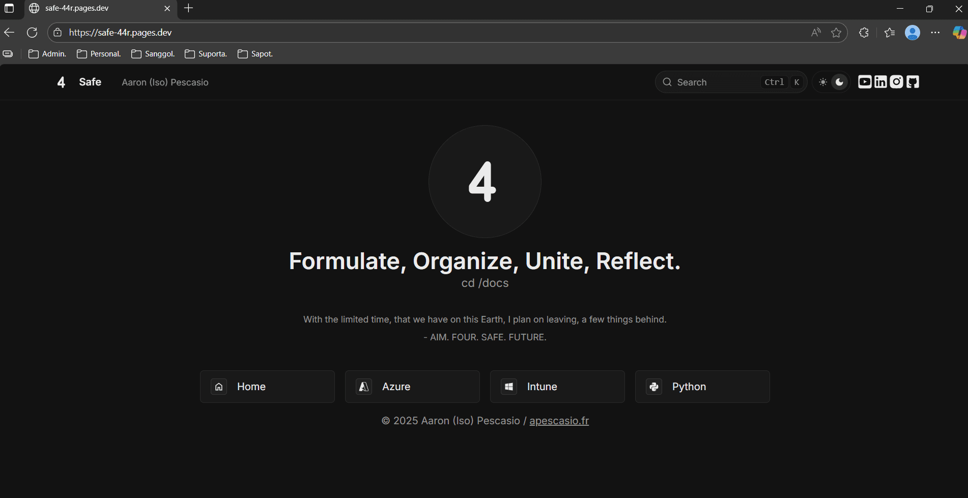
La aplicación ya es accesible públicamente.
Step 11: Dev branch git switch -c dev
Supongamos que quiero subir mis cambios solo a una rama dev (pruebas) y no directamente a main; puedo hacerlo ejecutando el comando: git switch -c dev.
Step 12: Azure: Added basics doc + enabled ImageZoom
Ahora añadimos un nuevo documento a la carpeta Azure; ejecuto npm run dev al mismo tiempo para ver los cambios localmente.
- Primero creo un archivo nuevo y lo llamo
azure-basics.mdx. - Empiezo poniendo un título, luego un encabezado principal escribiendo 2 almohadillas; si quiero un subencabezado, pongo 3.
- Actualizo el archivo meta.json dentro de la carpeta Azure, para que incluya el nuevo archivo como parte de Azure. Si no hago esto, nunca estará disponible en el sitio.
- Puedo poner una imagen en el documento usando
/images/azure/filename.png; por supuesto, deben existir las carpetas y el archivo png.
Si tienes imágenes de menos de 5 MB, te recomiendo usar TinyPNG para mantener la misma calidad pero con menor tamaño.
---
title: Basics of Azure
---
## Azure: What Exactly Is It?
**Azure** is Microsoft's cloud platform.
### Azure Sub Header Example
Image below :
Luego hice que las imágenes fueran ampliables habilitando ImageZoom.
import { ImageZoom } from 'fumadocs-ui/components/image-zoom';
import defaultMdxComponents from 'fumadocs-ui/mdx';
import type { MDXComponents } from 'mdx/types';

export function getMDXComponents(components?: MDXComponents): MDXComponents {
  return {
    ...defaultMdxComponents,
    img: (props) => <ImageZoom {...(props as any)} />,
    ...components,
  };
}
Step 13: Copilot: Added folder + index + icon
Supongamos que quiero añadir una nueva carpeta como Copilot.
- Primero copio y pego un archivo de icono existente en la carpeta components.
- Lo renombro a
copilot.tsxy renombro la función. - Elimino el svg duplicado => pego el nuevo svg del icono (normalmente de IconesJS) => y actualizo el archivo
consts.tscon Copilot. - Creo la carpeta
copilotencontent\docs=> creo dentroindex.mdx+meta.json=> actualizo elmeta.jsonglobal con copilot.
Step 14: Dev branch git push -u origin dev
Como hice git switch -c dev, enviaré mis commits a la rama dev ejecutando: git push -u origin dev.
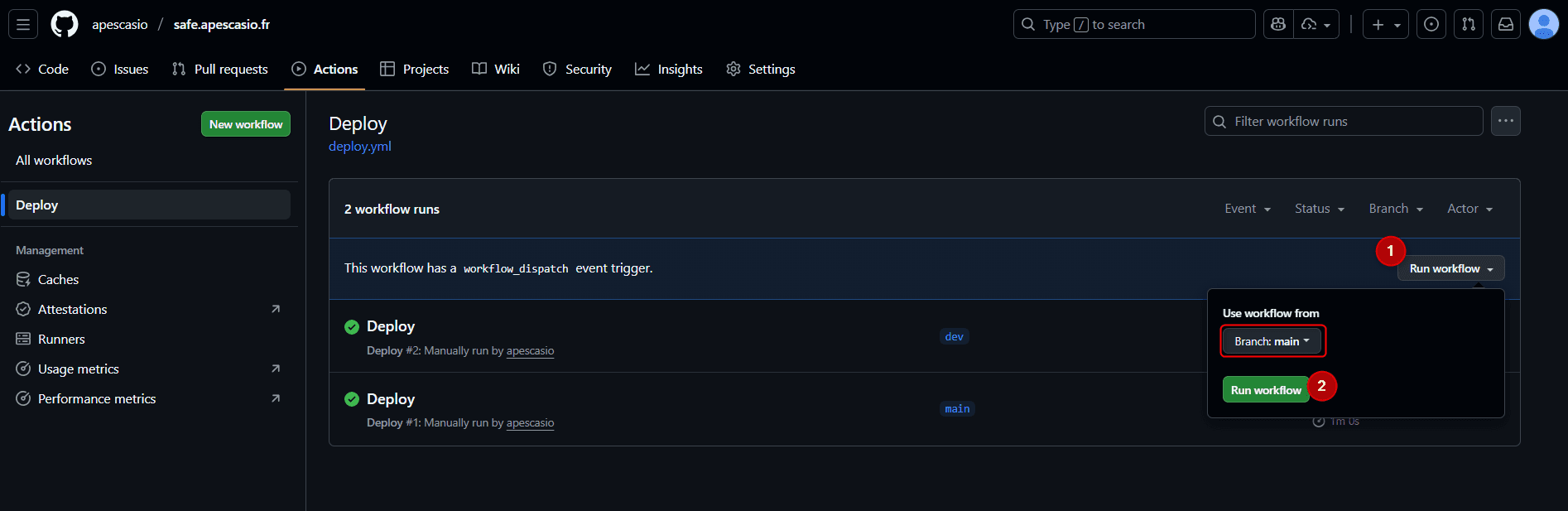
A continuación, vuelvo a la pestaña Actions de mi repo de GitHub, hago clic en Deploy y ejecuto el flujo de trabajo desde la rama dev.
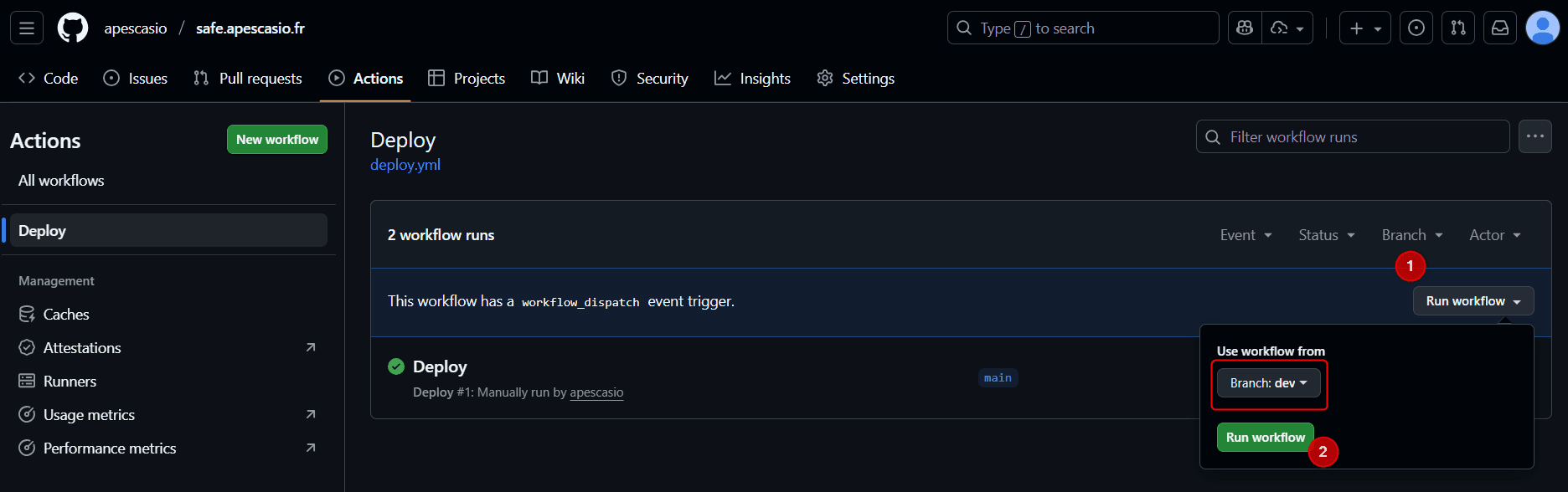
En Cloudflare Pages, ahora puedo ver un nuevo entorno dev.
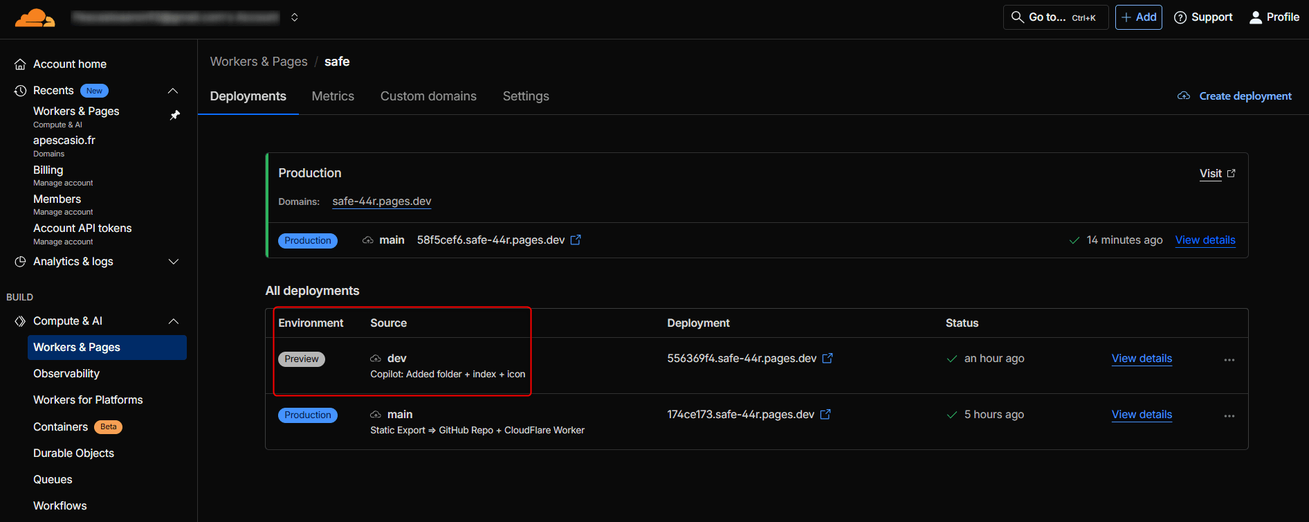
Para acceder a la app en la rama dev, simplemente puedo añadir la palabra dev al enlace principal/de producción.
Así, si mi enlace principal es safe.apescasio.fr, puedo acceder a la rama dev mediante dev.safe.apescasio.fr.
Si estoy satisfecho con el resultado en la rama dev, entonces puedo hacer merge; en términos simples, llevar los cambios de dev a la rama main.
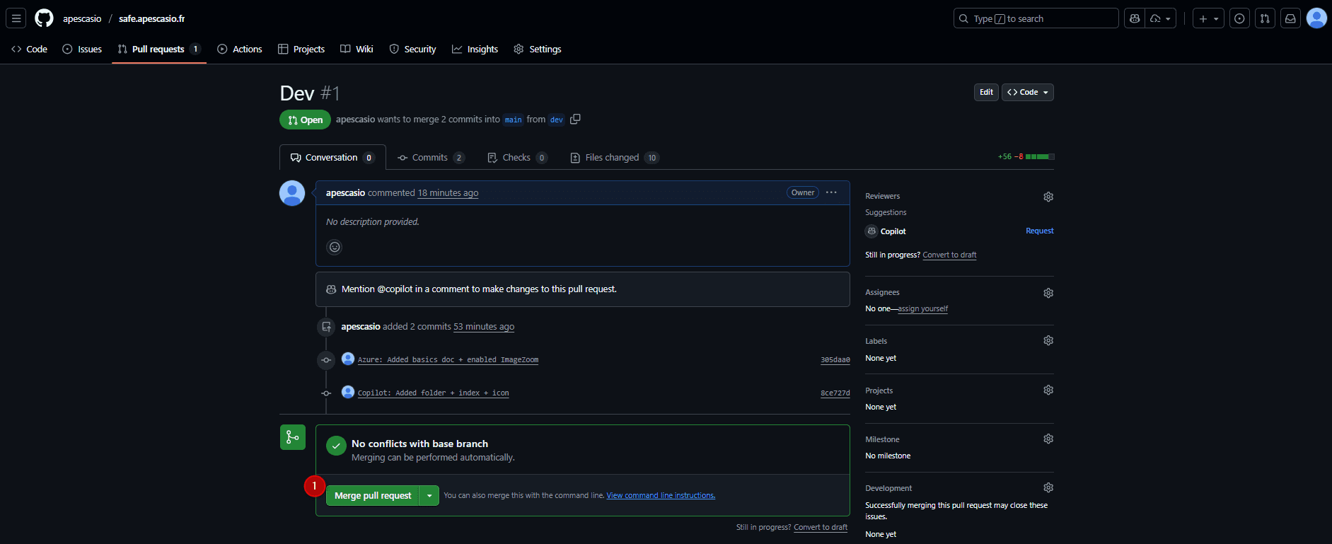
Ahora que main es igual que dev, vuelvo a Actions, Deploy y ejecuto el flujo de trabajo desde la rama main.
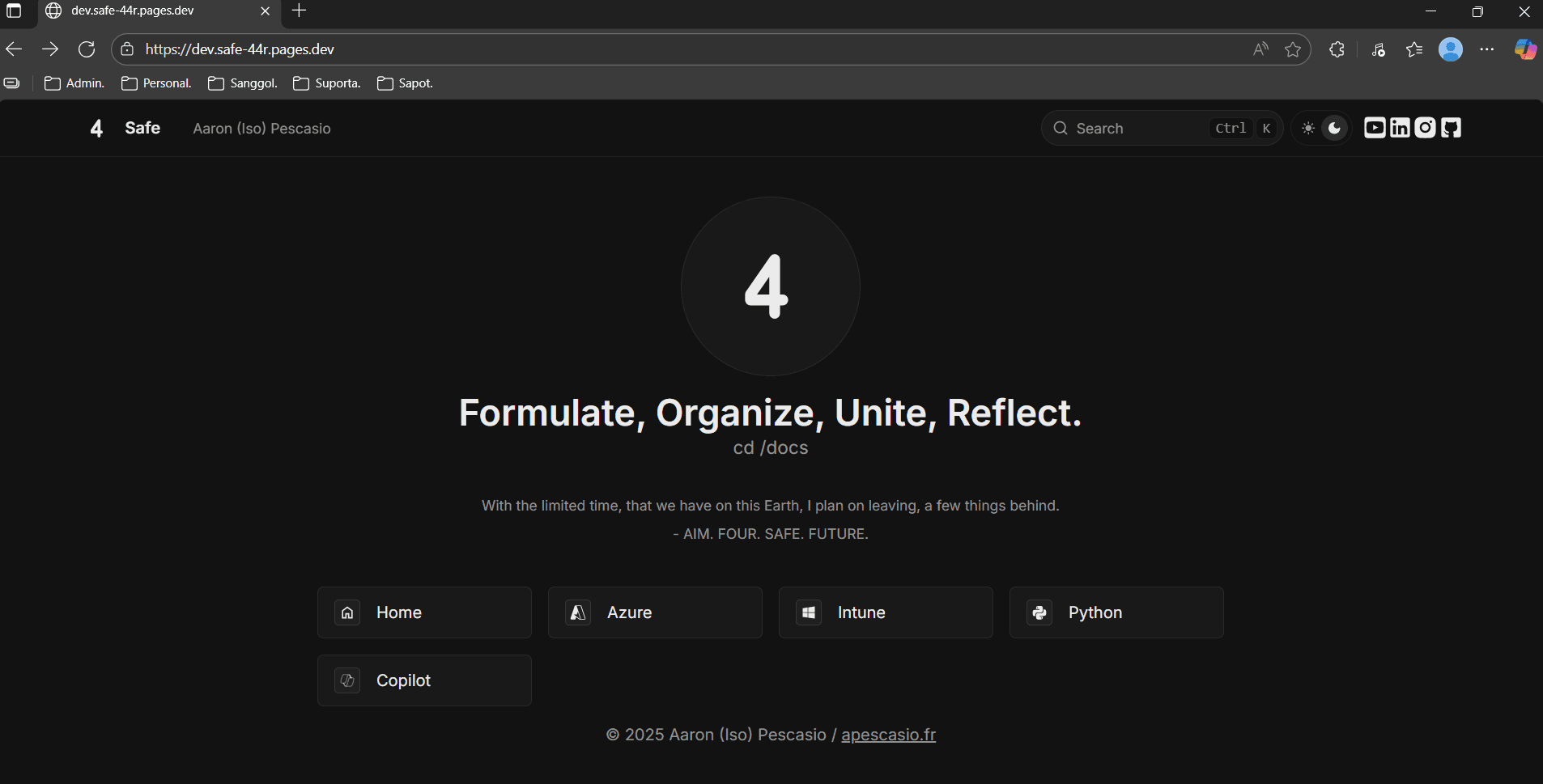
Al ir al enlace principal, ahora puedo ver el botón de Copilot, lo que significa que el merge y el despliegue se realizaron correctamente.

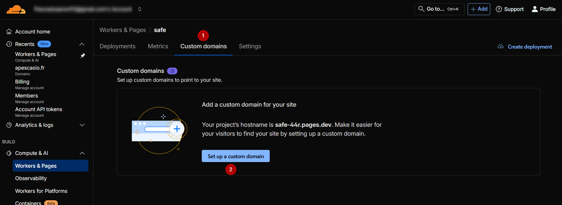
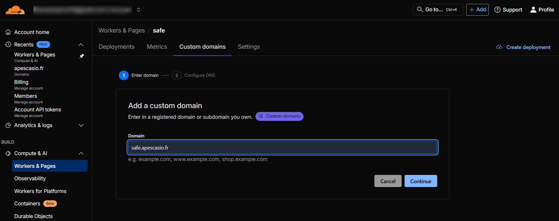
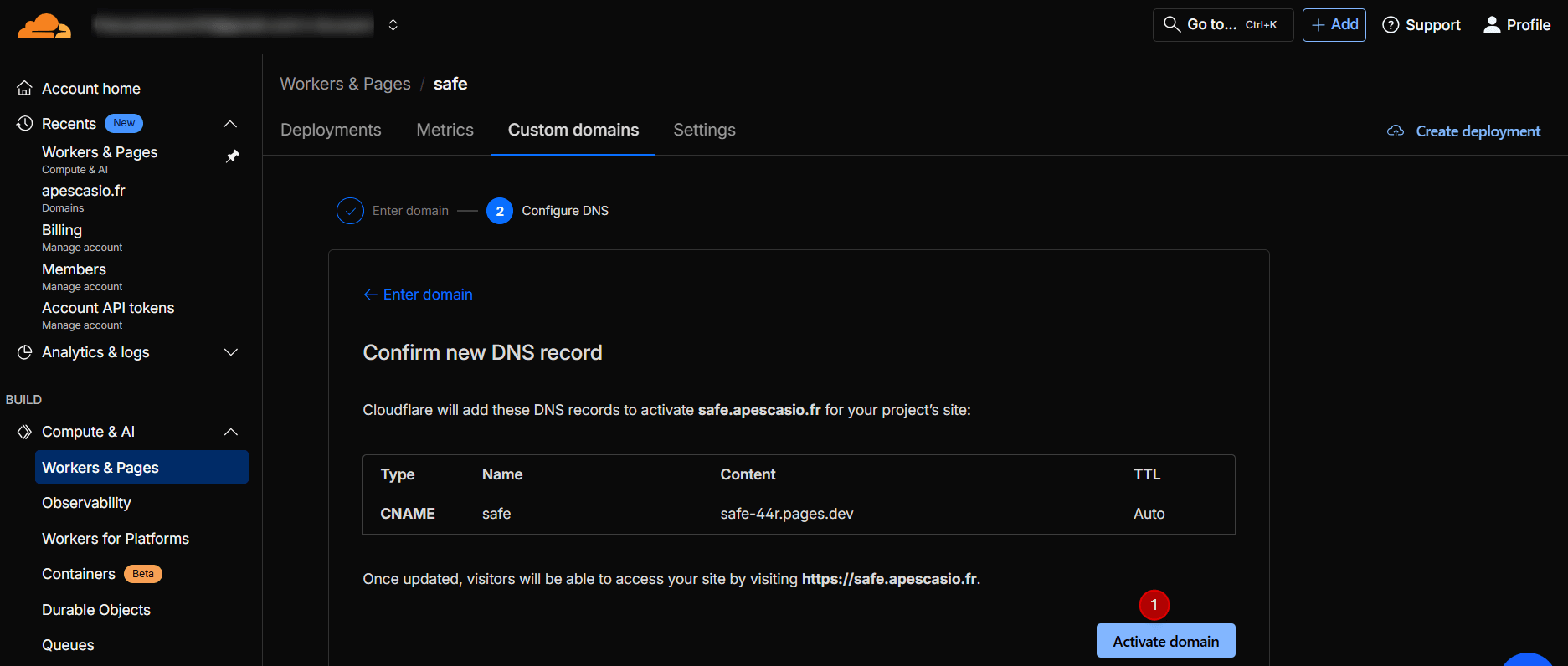
Step 15: Custom domain (Optional)
Si tienes tu propio dominio personalizado, puedes usarlo añadiéndolo a la página de Cloudflare.
Eso es todo.
Post F.O.U.R Fumadocs App Ramblings
Así es como personalmente hice mi app de notas, pero siéntete libre de explorar y crear por tu cuenta.
Puedes usar la documentación oficial de Fumadocs para crear tu propio estilo.
El mejor consejo que sigo una vez al mes es: romperlo todo y volver a reconstruirlo, una y otra vez.
Una vez al mes formateo mi PC y pongo todo de nuevo mediante PowerShell.
Una vez al mes destruyo mi lab tenant, y lo rehago todo, ya sea creando agentes Copilot o Autopilots Full Cloud de Intune.
Sigo aprendiendo en mi ciclo 8, y seguiré en el 9, 10 y así sucesivamente.
La repetición es simplemente la madre del aprendizaje, convertiré todas mis maldiciones en bendiciones.
Gracias por tu tiempo.
Última actualización: